Connector
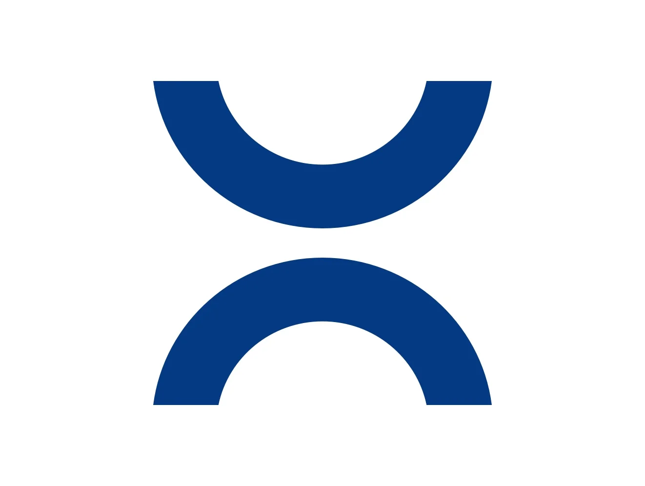
The new figurative mark, the connector, serves as a (graphic and metaphorical) link. Our connector links our decades of experience with our modern spirit. It links our agile mindset with our corporate culture. And our partnerships with solutions. After all, RAUMEDIC brings people together with the products they need.
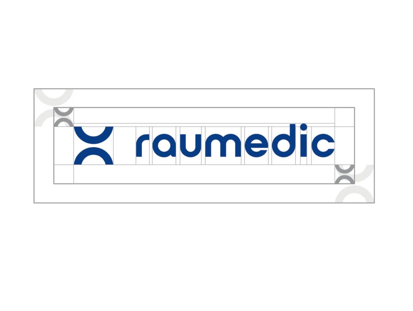
Protective space
For the optimal effect of the new logo, we have predefined a protective space. This specifies the minimum distance to the edge or nearest object. Ideally, the distance to be used is the attached connector. The prescribed minimum distance is in any case the attached connector – reduced by 50%.
Dos
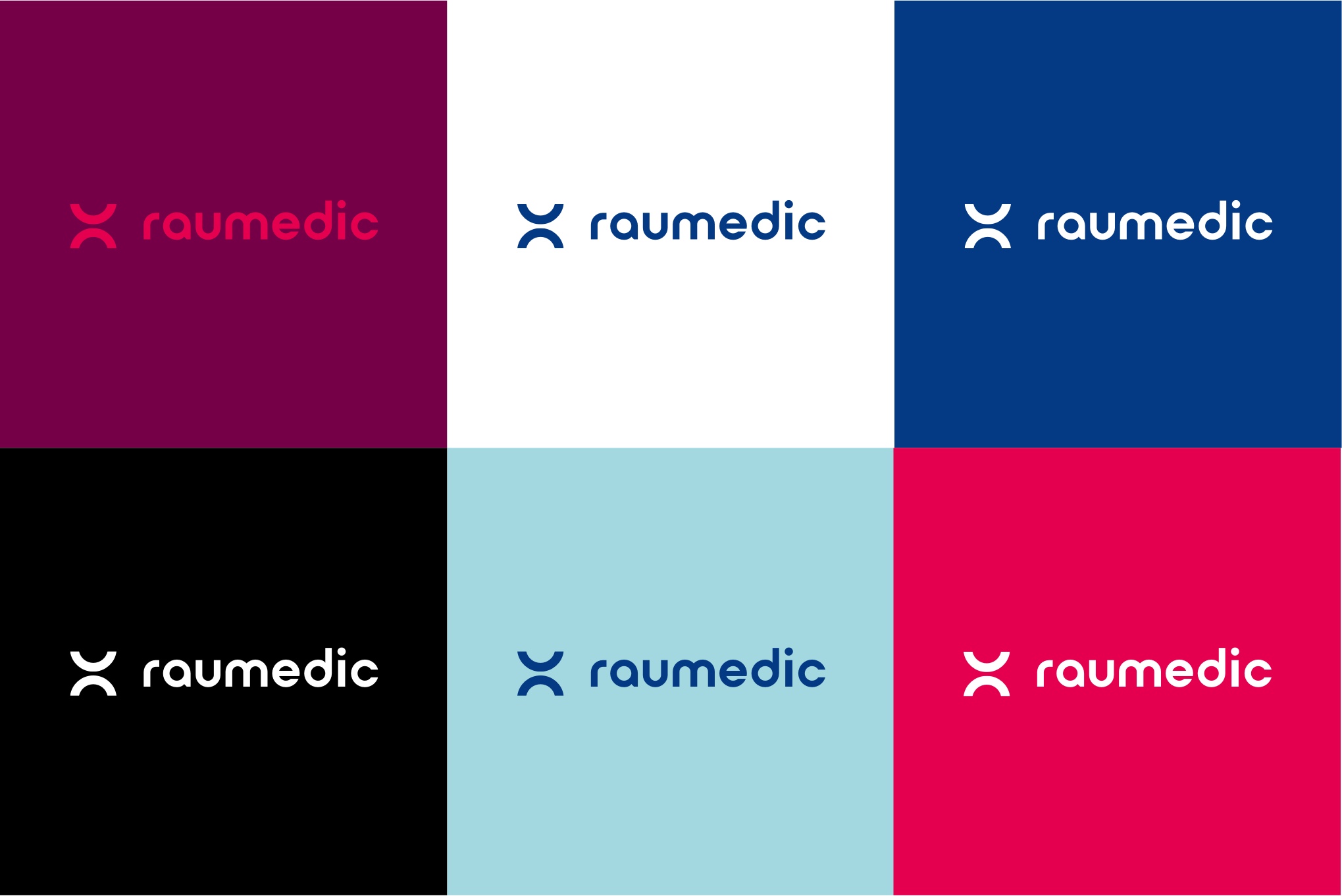
The logo can be used in all defined colors. Excluded from this are color gradients of any kind and the two gray tones “factual gray” as well as “strong gray” due to readability. The logo must always be aligned in ascendingly and placed in a free corner to guarantee recognition value. The connector may be used detached as a figurative mark.

Don’ts
Both the complete logo and the figurative mark alone may not be stretched or compressed. The connector is to be used exclusively in the positioning in front of the lettering and may also not be rotated or otherwise altered.

