Imagery
Open and exciting
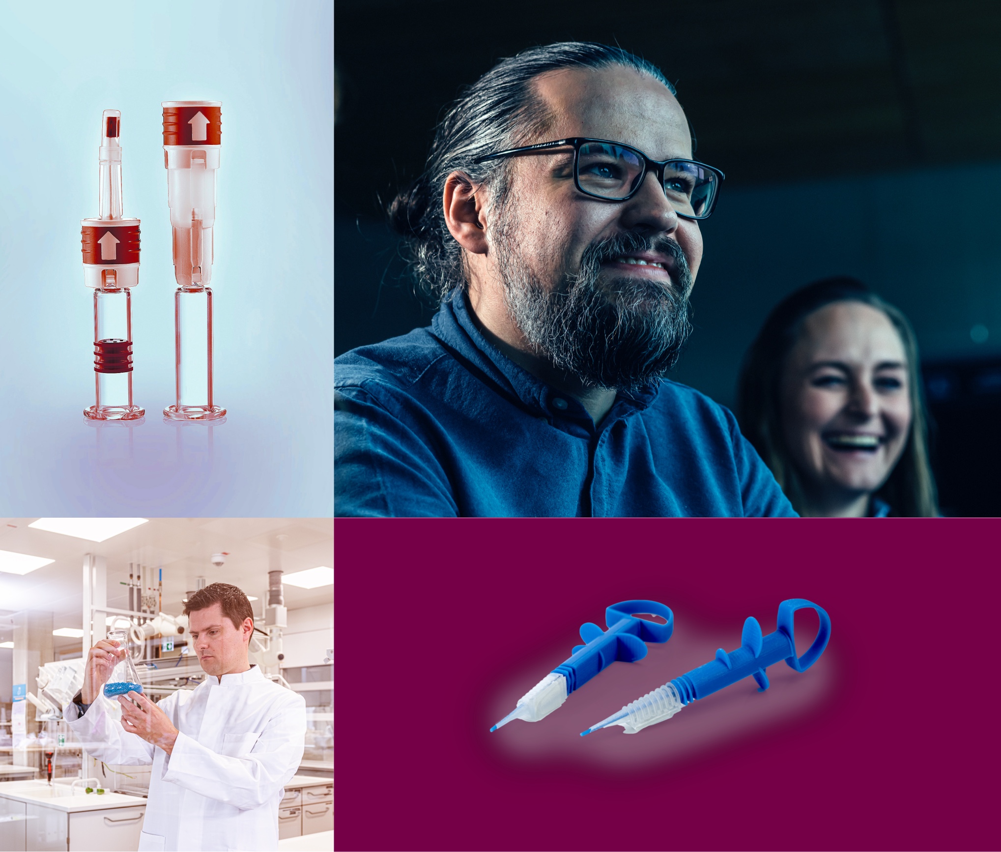
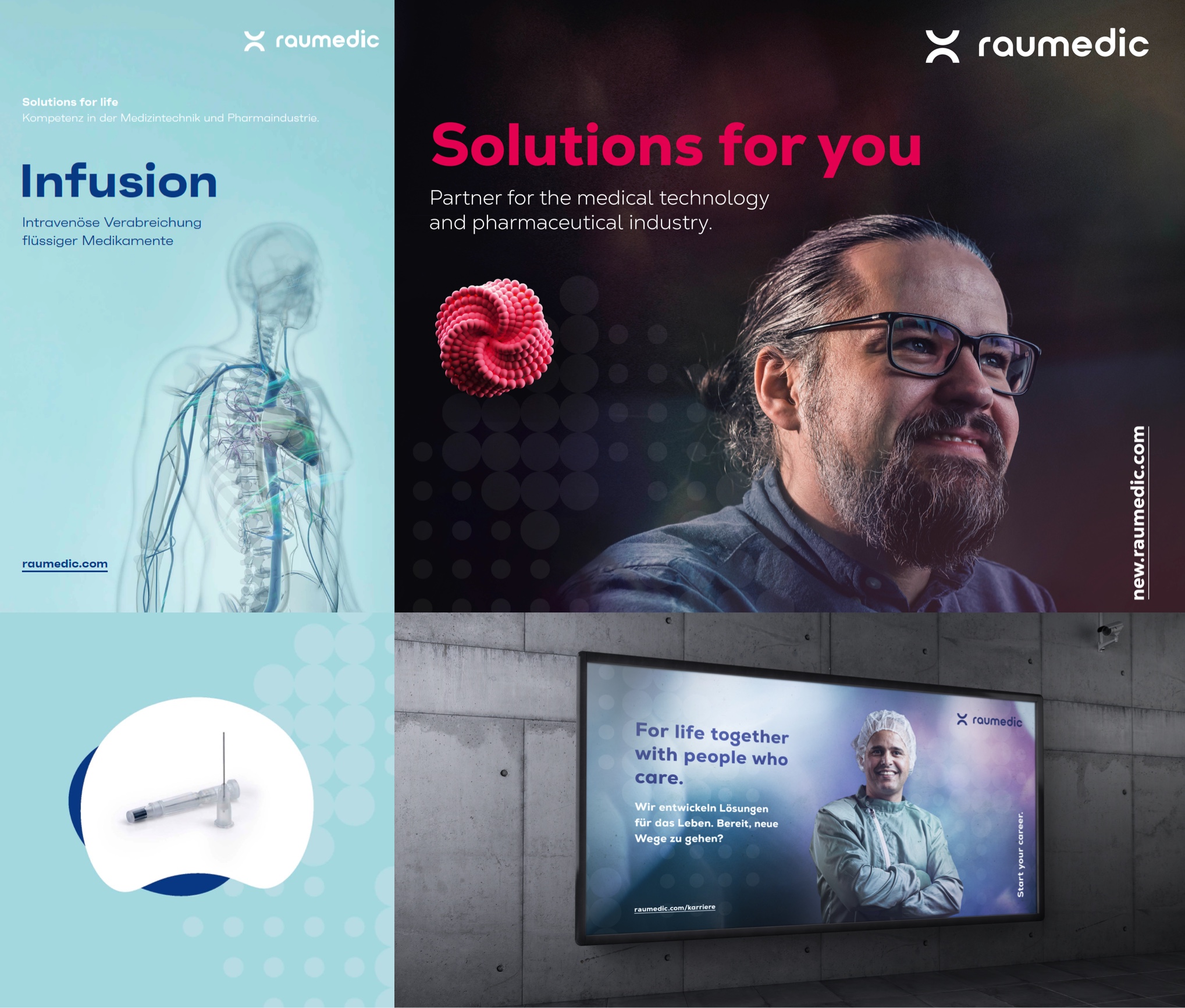
RAUMEDIC delivers what RAUMEDIC promises – and is open to new ideas. The visual language of the new brand should also express this. Because we show people and situations just as they are.

People
On the image level, the motifs are selected, but by no means forced. We put people and their expertise at the center of our imagery and capture situations in exciting perspectives.

Product
At the product level, we use “staging blue” as an element of recognition. The products appear floating to convey a feeling of lightness. Overall, we focus primarily on material aspects in our visual language.

Application areas
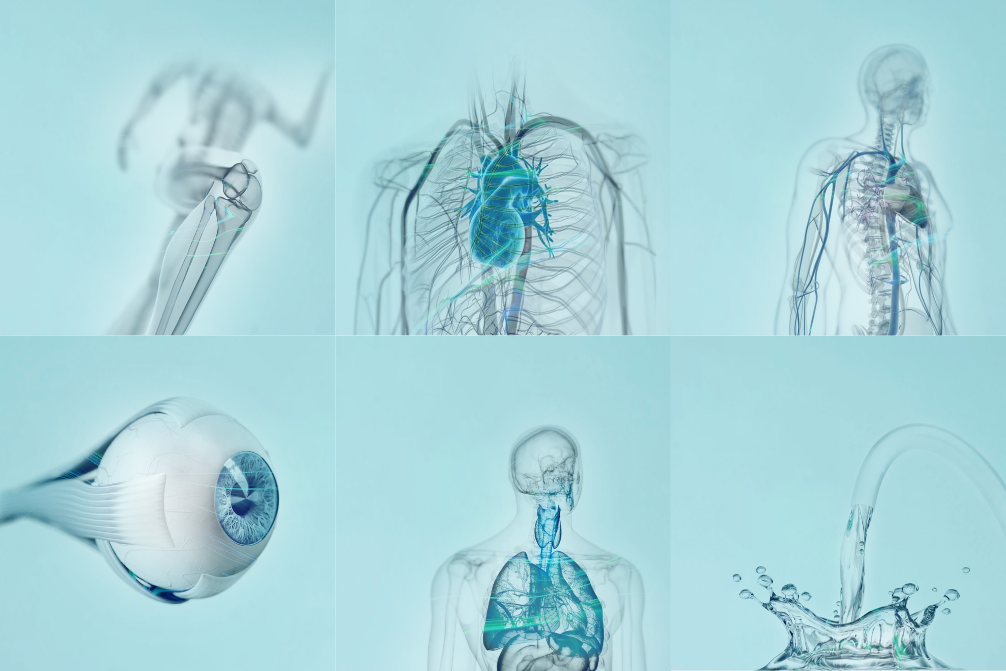
Applications in or on the body are also shown on “staging blue”. On all pictures of the application areas, a transparent body is shown, and the body part concerned is highlighted in color. We use this clean look to clearly show the application for which our products were developed.
Dos
Each image serves as a powerful representation of the brand to the outside world. Motifs should give space to the typo and provide enough free space for graphic elements. . Likewise, products must be shown in full and must not cropped.
Don’ts
Image colors should be displayed as authentically as possible and should not be distorted. Product images may only be placed on the specified color areas “clean white” or “staging blue”.
