Typography
Independent and flexible
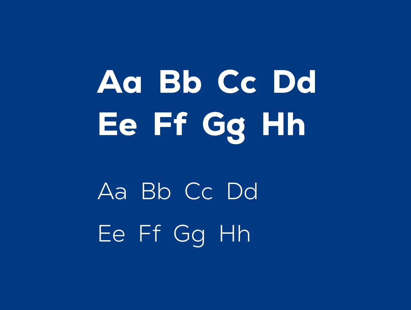
Raumedic is unique. This is reflected in our fonts: Nexa and Nexa Text. This combination of typography offers both flexibility and a holistic brand perception.
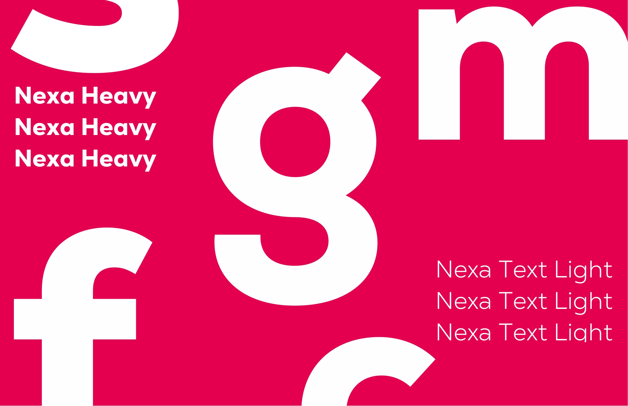
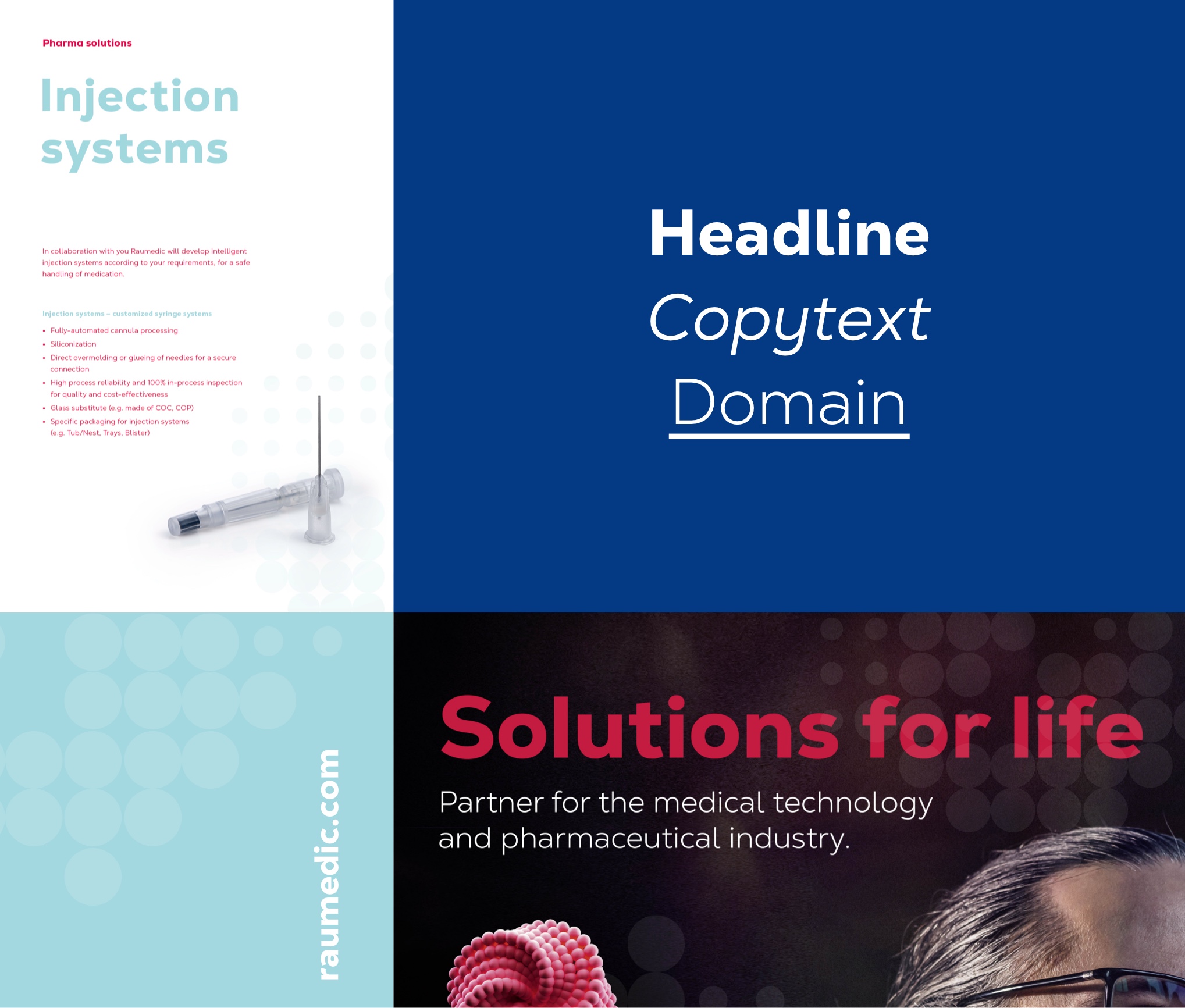
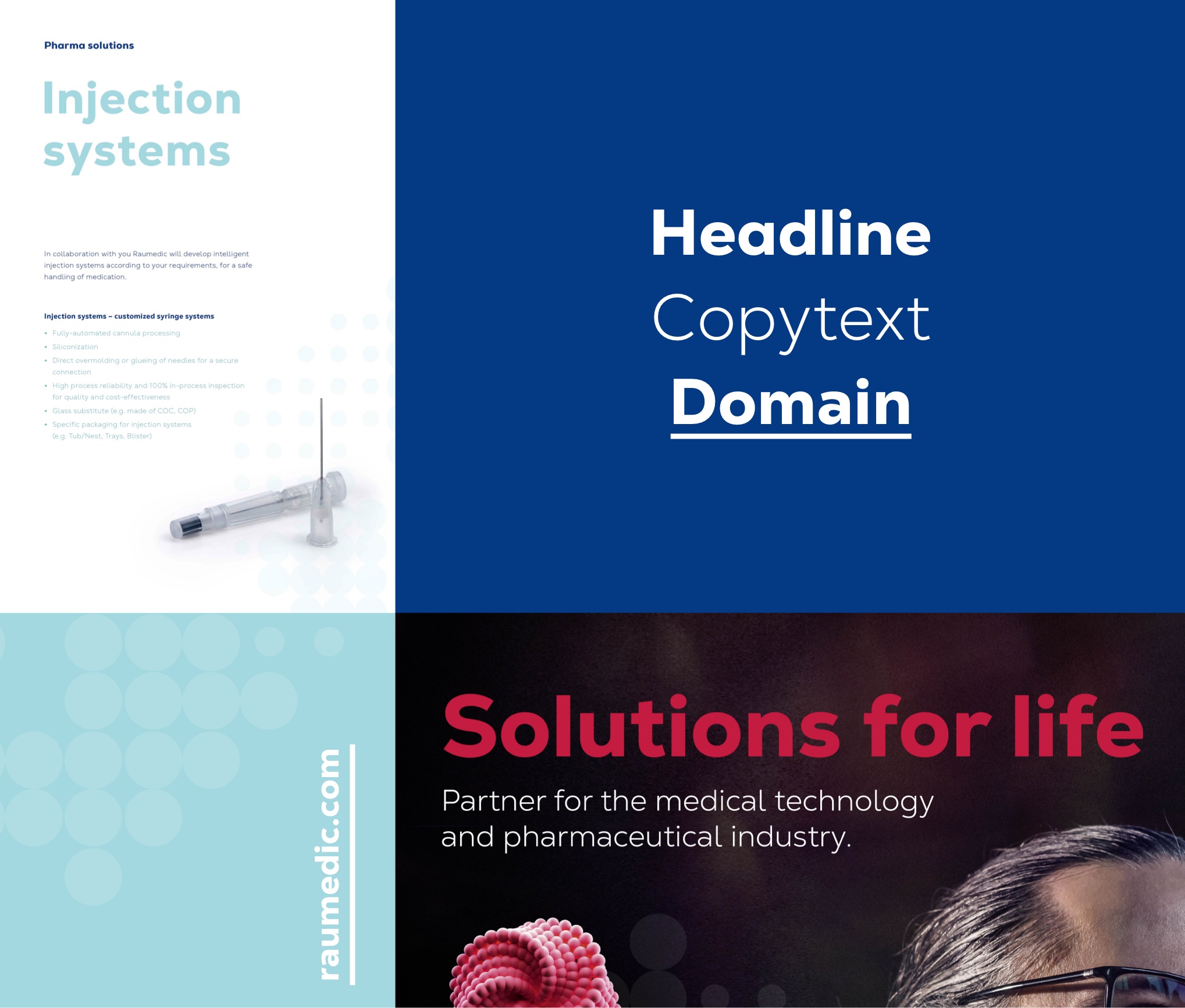
Nexa’s distinctive typefaces underscore the independence of our new brand. They serve as a central design element. The typeface is both strong in character and easy to read. For headlines, we use Nexa Heavy. For functional use in body text, we use Nexa Text Light. The domain can be set in Nexa Text Heavy.
Dos
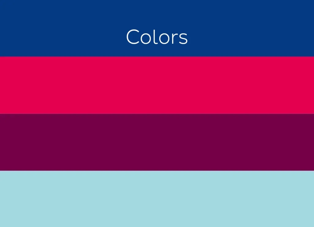
Only the above-mentioned fonts are to be used. In addition, body text must always be set in “safety blue”, “easy berry” or “clean white”. As an exception, Arial can be used as a font for internal use only.
Don’ts
Typography must not be overlaid by other graphic elements such as brand code or illustrations. In addition, headlines must not be set in capital letters.
