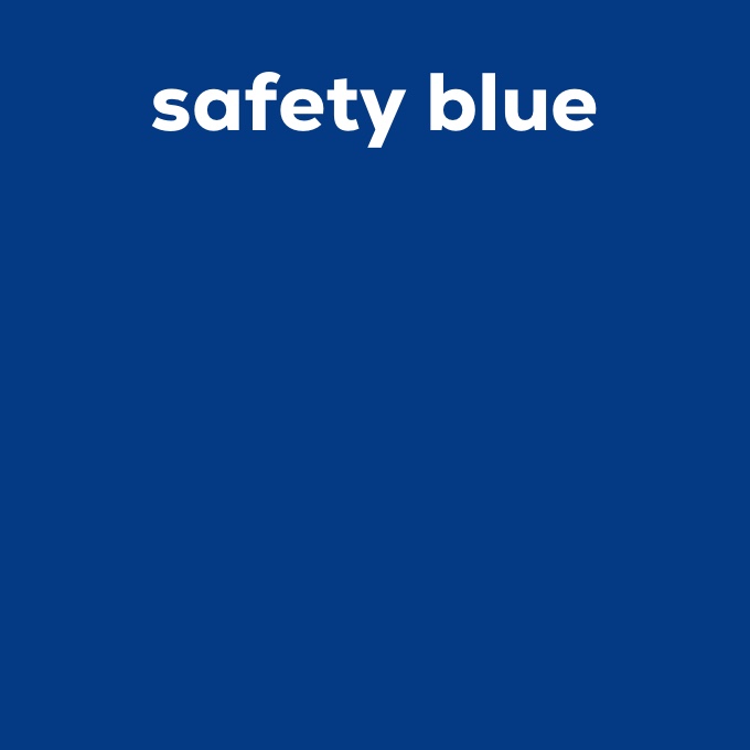
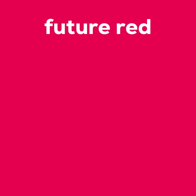
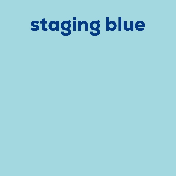
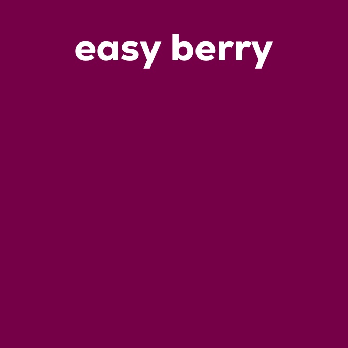





26 / 99 / 12 / 50
118 / 0 / 71
350 60 35

40 / 0 / 14 / 0
163 / 216 / 224
210 80 15
Primary colors
The brand colors “safety blue”, “staging blue” and “future red”, “easy berry” are hierarchically equivalent. It is important that the colors interact harmoniously in the overall layout. Contrasts may be played with, but readability must not be restricted by the combination of the two primary colors.
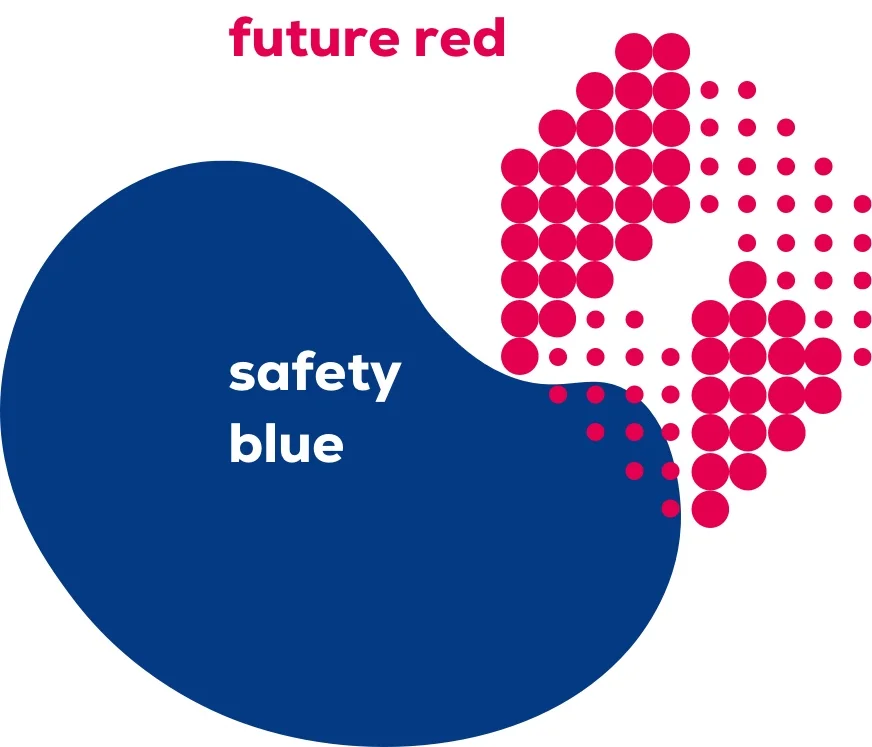
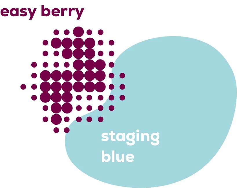
“staging blue” originates from the original blue tone of Raumedic and stands for the reliability of Raumedic. The blue tone radiates safety and reliability and represents RAUMEDIC’s roots. The progressive “future red” embodies curiosity about the future and the courage to break new ground. The bright color depicts the new part of RAUMEDIC in a bright future. “easy berry” is the (color) bridge between the traditional roots and the way into the future.
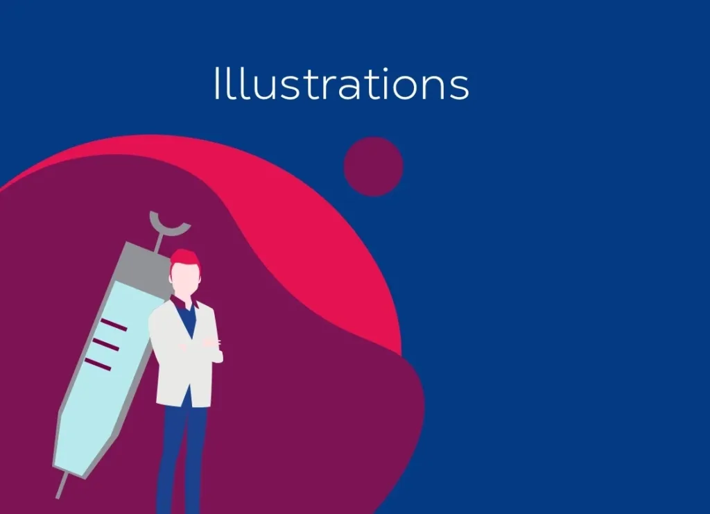
In rare cases, it is also possible to work with transparencies. Especially “future red” serves in the illustrative level as a key color with its transparencies.
Secondary colors
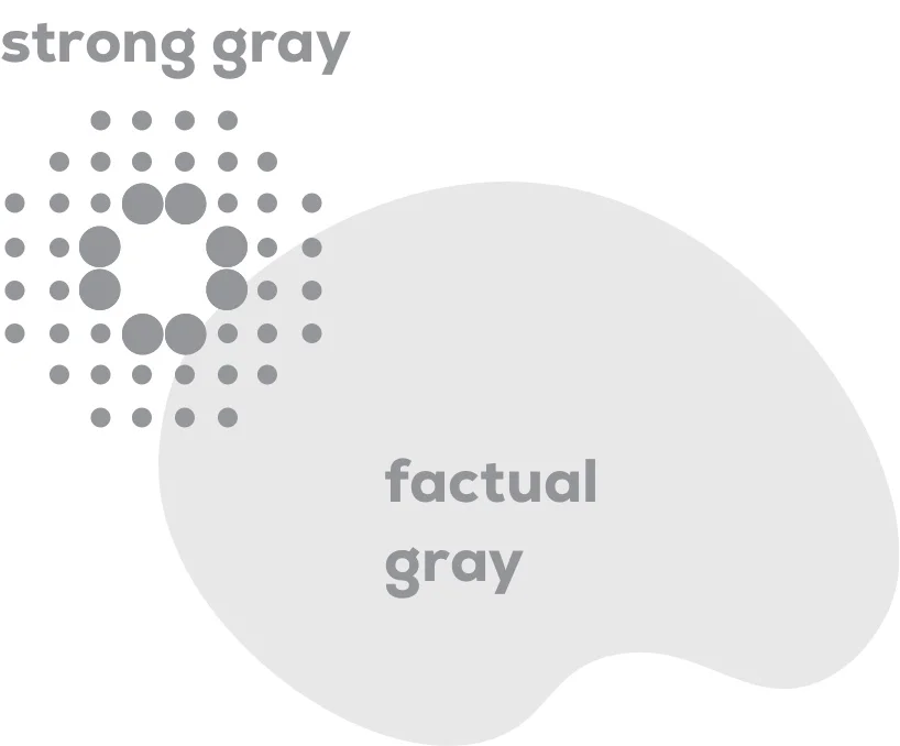
As a further design element, the primary colors are supplemented by the secondary colors “strong gray” and “factual gray”. Especially in the functional, technical level or for tables, the color tones “strong gray” and “factual gray” can support the otherwise bold color design. “Core black” and “clean white” can also be used in a reduced manner. White space is used to bring calm and expressiveness into the colorful world of colors.
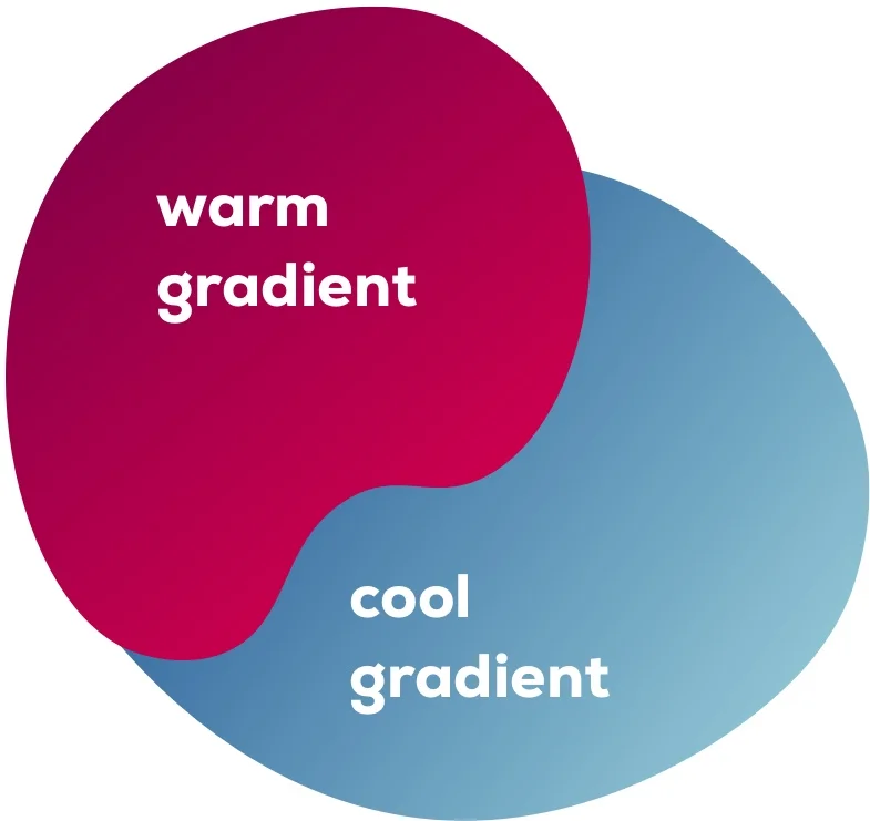
Gradients
Rarely, gradients can also be used, these result from the combination of “staging blue” with “safety blue”, as well as the transition from “easy berry” to “future red”.
Application of picture language
Product images are to be set either to “clean white” or to “staging blue”. Images from or in the clean room are to be assigned to the bluish color world. Emotional photography with a focus on people have a warm color scheme.
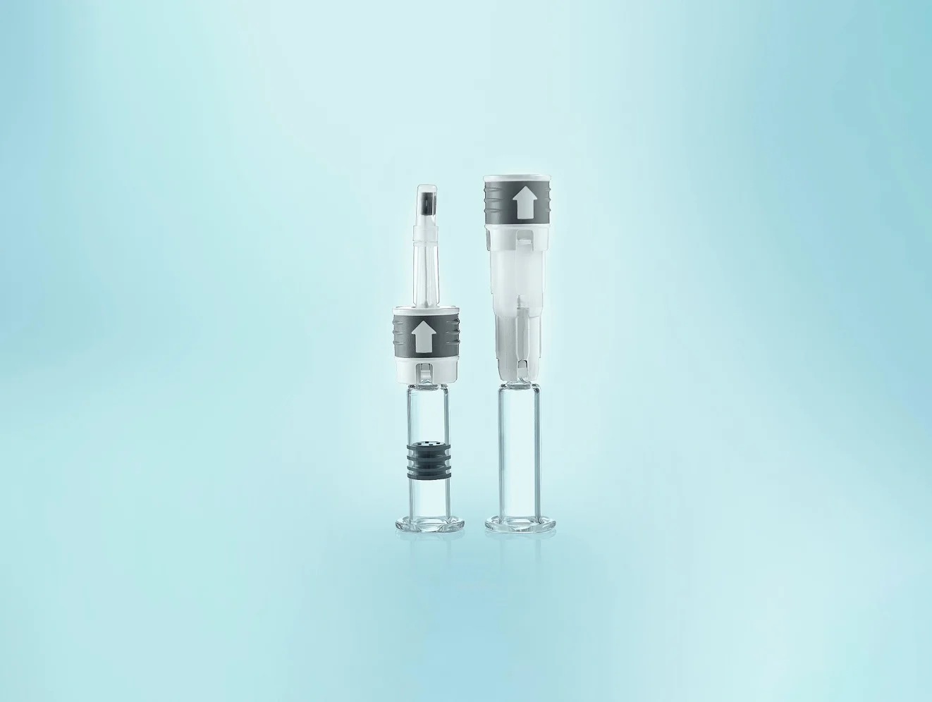

Basically, all images that put people in the foreground, as well as image images of all kinds have a warm color scheme. Thus, our claim as well as purpose is also shown through our photography.
Dos
“future red” or “safety blue” are brand-defining colors. Therefore, at least one of these colors should always be used. “future red” serves as a signal color and is therefore suitable for setting highlights. In general, the color combinations should be strong but not overloaded.

Don’ts
Color values or defined gradients must not be changed. Likewise, color combinations must not take precedence over legibility.
