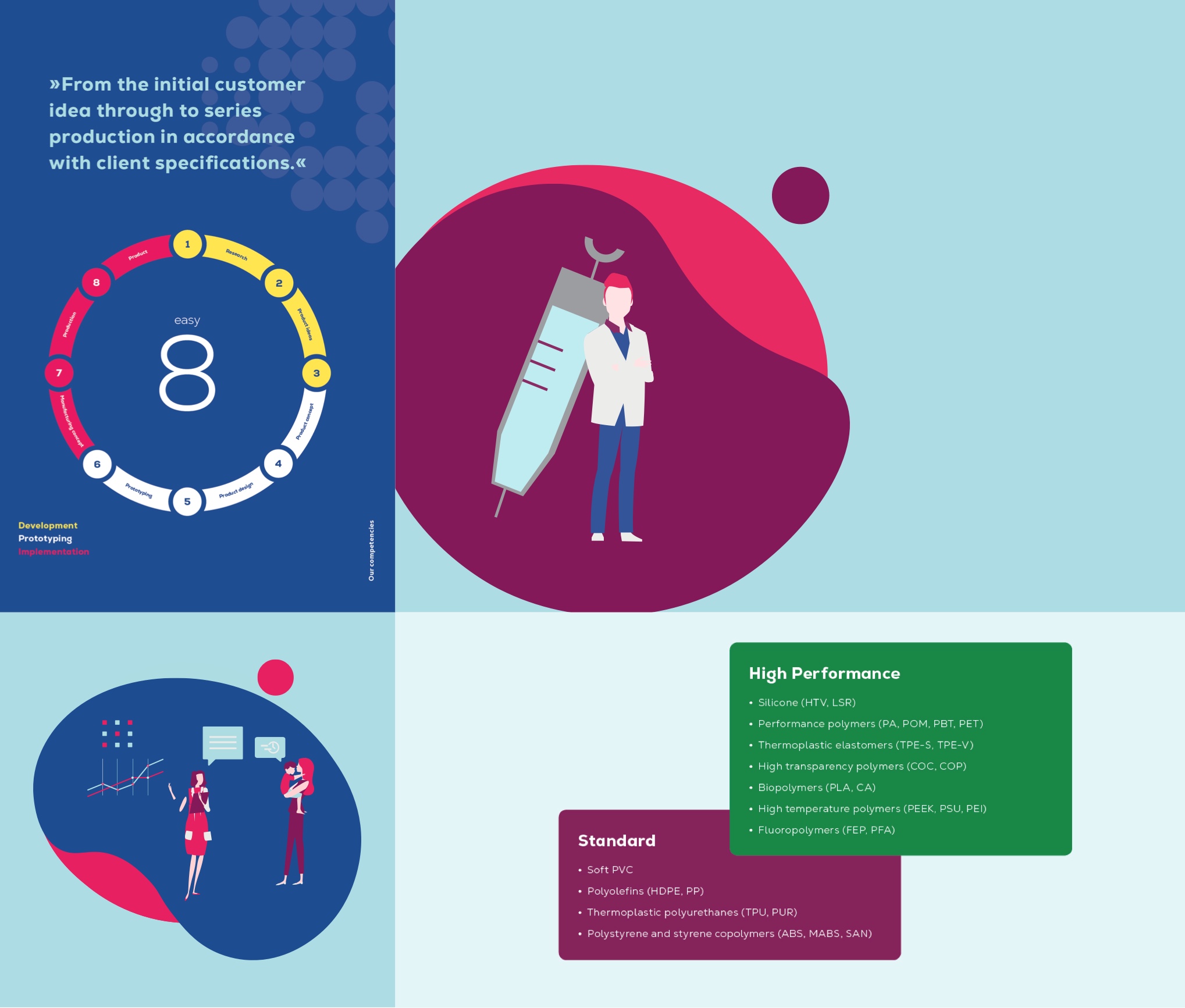
Our illustrations are mainly represented by large areas of color and consist of soft shapes that are organically deformed and of a complementary circle. These elements are layered on top of each other. On the top element, symbols, products and people are shown, but without facial expressions.
Dos
The illustrations are deliberately reduced and simple. This rudimentary presentation avoids unnecessary complexity. Thus, the focus remains on the visual support in conveying content. The use of the brand colors also promotes recognition at all levels.

Don’ts
Only predefined colors may be used. Likewise, care must be taken that illustrations do not become too small, and that shapes are used as specified. If an illustration is placed at the edge, corner flashes must not be left free. In this case, the respective an appropriately sized color area is to be placed in the background.

